The challenge
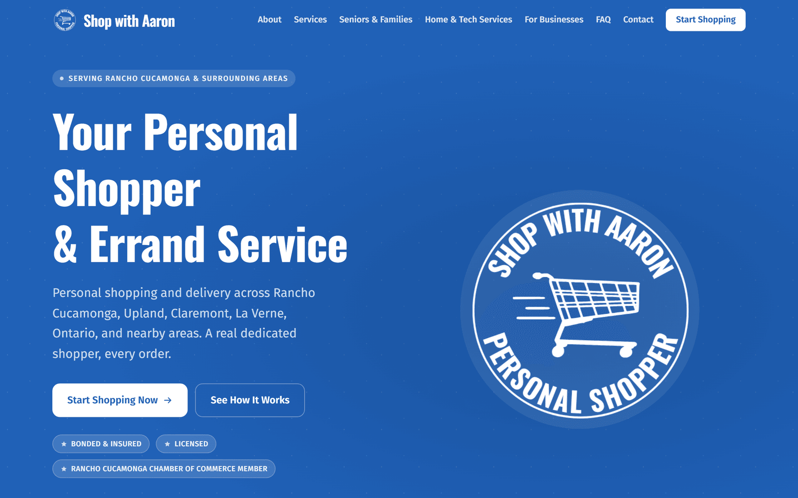
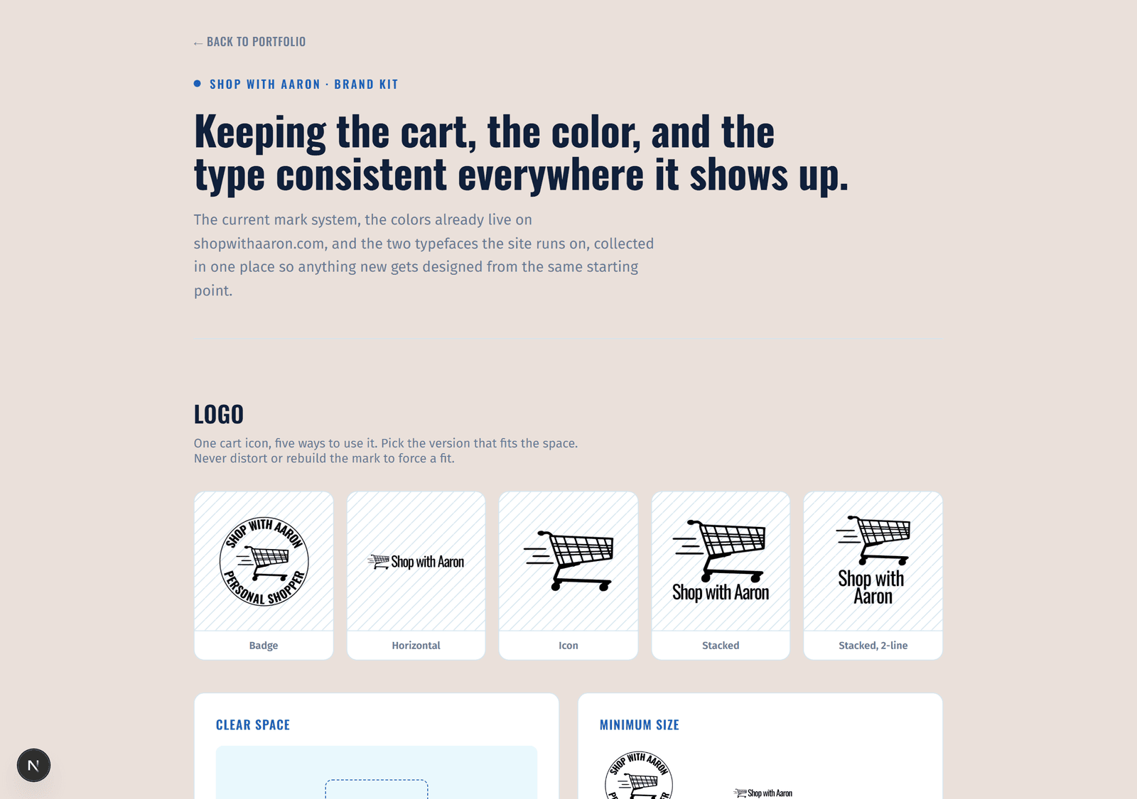
Shop with Aaron's logo has been years in the making, refined across dozens of versions as the business found its own voice. What it never had was a system: one place showing which version was current, how each one should be used, and the colors and type that belonged with it.
What I built
I brought years of logo work together into one documented system: five purpose-built marks built around a single cart icon, a badge, a horizontal lockup, a standalone icon, and two stacked layouts, with the two earliest attempts retired along the way. I paired that with the color palette and typefaces already live on shopwithaaron.com, plus real usage rules: clear space, minimum sizes, and what not to do.
Highlights
- Five-mark logo system built from one icon
- Live color palette with real WCAG contrast ratios
- Clear space and minimum-size guidance
- Typography spec matching the production site
- A reference other designers could actually follow